TL;DR
Most SaaS integration pages fail in AI search because they look polished but lack the structure needed for summarization and citation. Clear definitions, named workflows, visible constraints, and maintained proof blocks make these pages easier to rank, cite, and convert.
Most SaaS integration pages are built for design galleries, not discovery. They look polished, but they do not give search engines or AI systems enough structured context to understand what the integration does, who it is for, or why it matters.
That gap matters more in 2026 because the path to conversion often starts before the click. If a page cannot earn inclusion in AI answers, it loses the citation, the visit, and the pipeline that follows.
Why polished integration pages still disappear from AI answers
A good-looking page is not the same as a page that can be understood, summarized, and cited. That is the central problem with many SaaS integration pages.
AI systems tend to favor pages that are explicit. They look for clear definitions, consistent naming, practical detail, and evidence that the page solves a real use case. Many integration pages offer none of that. They rely on logos, short blurbs, and generic claims like “streamline your workflow” or “connect seamlessly.”
AI search ignores pages that look complete to humans but remain incomplete to machines.
That is why these pages fail in the new funnel:
- Impression
- AI answer inclusion
- Citation
- Click
- Conversion
If the page breaks at step two, the rest of the funnel never starts.
This is not just an AI search problem. As documented by Rock The Rankings, properly structured integration pages are a key opportunity for driving high-intent, right-fit traffic. The same structure that helps a page rank also helps it get pulled into generative answers.
The issue is usually structural, not cosmetic. Teams often ship an integration hub because customers expect one, partners ask for one, or the product has enough connections to justify a marketplace page. But the page is treated as a design asset instead of a search asset.
That creates four common weaknesses:
- The page does not explain the integration in plain language.
- The use case is implied instead of stated.
- The page architecture is thin, often just a hero, logo, and CTA.
- The content is not updated often enough to stay trustworthy.
The result is predictable. AI systems cite help docs, comparison pages, category pages, or partner pages that are easier to interpret.
The structural signals AI search actually needs
The fastest way to diagnose SaaS integration pages is to ask a simple question: could a third party summarize this page accurately in 60 words without guessing?
If the answer is no, AI systems will struggle too.
A useful review model is the integration page clarity model. It has four parts:
- Definition: What is this integration, exactly?
- Use case: What problem does it solve, for which team?
- Proof: What evidence shows it works or matters?
- Path: What should the visitor do next?
Most weak pages skip at least two of these.
Definition comes before design
Many pages assume the visitor already knows both products and already understands the relationship between them. That assumption kills discoverability.
A stronger page states the relationship immediately. For example:
- “Connect Salesforce and Zendesk to sync support context into sales workflows.”
- “Send Stripe payment events into HubSpot for revenue-based segmentation.”
- “Push product usage events from Segment into Intercom for lifecycle messaging.”
Those lines are not clever, but they are citable. They tell a search engine, an LLM, and a buyer what the integration does.
Use cases need named outcomes
The second structural signal is use-case specificity. Pages built around generic convenience language rarely surface in AI answers because there is nothing concrete to extract.
According to Nicelydone, integration areas are often labeled with terms like Marketplace, Connections, or Settings. That naming inconsistency matters because AI systems need clearer context about whether a page is public-facing product information, an internal setup screen, or a feature directory.
That means public SaaS integration pages should use language that removes ambiguity. A page should say whether it supports:
- lead routing
- ticket synchronization
- reporting consolidation
- billing automation
- onboarding workflows
- customer success alerts
This is also why pages built around a single buyer scenario often outperform generic marketplace entries. AI systems can summarize “sync support tickets to CRM records for account handoff” much more reliably than “connect your favorite tools.”
Proof matters because AI answers compress trust
When an AI assistant cites a page, it compresses the page’s authority into a short answer. Thin content struggles because there is nothing on-page to justify trust.
Proof does not need to be elaborate. It can include:
- supported triggers or actions
- setup requirements n- supported plan tiers
- partner status
- screenshots of the workflow
- customer example use cases
- short implementation notes
This is one reason benchmark pages from companies like Zendesk, Asana, and Databox are frequently referenced in discussions of strong integration page structure. As noted by Powered by Search, these companies represent a high standard for integration page layout because they explain the partner relationship, the use case, and the next step with much more clarity than most SaaS sites.
Path should match intent
Not every visitor is ready to install the integration immediately. Some want to evaluate compatibility, some want to compare alternatives, and some want to understand setup complexity.
Weak pages offer one CTA: “Connect now.” Stronger pages create multiple next steps:
- Install or connect
- Read setup documentation
- See supported use cases
- Talk to sales for enterprise requirements
- View pricing or plan limitations
That makes the page more useful to readers and easier for AI systems to classify accurately.
The page rebuild that usually improves citation potential
The most effective fix is not a visual redesign. It is an information redesign.
The contrarian stance is simple: do not start with the integration gallery; start with the individual integration page. Many teams try to improve their directory layout first. That helps navigation, but it does not solve the core citation problem. AI systems usually need a strong destination page before the hub matters.
A practical rebuild often follows this order.
1. Rewrite the opening for machine clarity
The first screen should answer four questions in under 80 words:
- What tools are connected?
- What data or actions move between them?
- Who benefits from that workflow?
- What outcome does it create?
A weak opening:
“Seamlessly connect your stack and unlock productivity.”
A stronger opening:
“Connect HubSpot and Slack to send lifecycle alerts into shared channels, reduce missed handoffs, and keep sales and success teams aligned.”
The second version is more likely to be cited because it has nouns, actions, and a defined business outcome.
2. Add a use-case section before feature detail
Most pages jump from hero to installation steps. That is backwards for discovery.
Before setup detail, add a short section that names 3 to 5 real scenarios. For example:
- Notify account managers when a high-value support ticket is opened.
- Send qualified form submissions into the CRM with source attribution.
- Trigger onboarding tasks when a contract is signed.
- Sync billing events to customer health dashboards.
This section does two jobs at once. It improves buyer understanding and gives AI systems clean, reusable language.
3. Show compatibility and limits explicitly
Public integration pages often hide critical constraints until the doc layer. That creates frustration for buyers and weakens citation quality.
A better page makes these details visible:
- native integration or third-party connector
- required plan tier
- setup owner, such as admin or workspace owner
- data sync direction
- key limitations
- time to configure
This type of specificity also aligns with broader page conversion advice. Amply notes that service-related pages perform better when essential elements and actionable detail are present. For integration pages, that detail doubles as information density that AI systems can summarize.
4. Build a proof block, even without hard numbers
Most teams do not have public performance data for every integration. That is fine. The page still needs evidence.
A strong proof block can include:
- one customer scenario
- one screenshot of the workflow
- one quote from support, success, or product marketing
- one “best for” qualifier
A simple example:
Baseline: an integration page listed only a logo, a one-line description, and a single “Install” CTA.
Intervention: the page was expanded with a plain-language summary, four use cases, compatibility notes, and a setup expectations block.
Expected outcome: stronger qualification, fewer low-intent clicks, and improved odds of citation because the page now explains the integration clearly enough to summarize.
Timeframe: measure over 6 to 8 weeks using impressions, click-through rate, assisted conversions, and AI citation tracking.
That is not fabricated performance data. It is a credible measurement plan tied to the actual intervention.
5. Create summary-ready sections
Generative engines favor pages with extractable chunks. That means short paragraphs, specific subheads, and list structures that hold up when copied into an answer.
For example, a strong integration page might include these summary-ready blocks:
- What this integration does
- Who should use it
- Common workflows
- Setup requirements
- Limits and plan availability
- Related integrations
This approach mirrors what makes other SaaS pages easier to rank and cite. It is similar to the structural discipline used in trusted comparison pages, where clarity, proof, and scannable logic matter more than design flair.
What leading integration pages do differently
The best pages in the market are not just attractive. They are easier to interpret.
As highlighted by Powered by Search, leading examples such as Databox, Docusign, and Zendesk tend to share a few recurring traits:
- clear product naming
- concise descriptions
- visible partner relationship
- focused use-case explanation
- direct next steps
That pattern matters because AI systems reward clarity over branding language.
Public page vs internal settings page
A recurring mistake is treating the public integration page like an in-app settings screen. These are different assets with different jobs.
The public page should help with discovery, evaluation, and qualification. The settings page should help with configuration.
According to Nicelydone, many products use labels like Marketplace, Connections, or Settings for integration areas. That works inside the product, but public-facing pages need stronger taxonomy. If the page title, body copy, and metadata do not make the page’s purpose obvious, AI systems may misclassify it.
A practical fix is to separate these layers:
- public page: explains value, use cases, compatibility, and next steps
- help doc: explains setup process and troubleshooting
- directory page: groups related integrations by workflow or category
Freshness is not optional
Many integration pages go stale faster than teams realize. The partner logo changes. A trigger is deprecated. Pricing or tier requirements shift. Supported fields change. The page remains live but becomes less trustworthy.
That matters because freshness is a trust signal. SaaSpo emphasizes that modern integration page examples are updated frequently, which reflects how quickly expectations and design patterns move. In practice, stale pages are less likely to be cited because they conflict with newer documentation or marketplace records.
A simple refresh cadence helps:
- monthly: review top 20 integration pages by traffic or pipeline influence
- quarterly: update screenshots, plan notes, and supported workflows
- twice yearly: rewrite pages with thin copy or poor conversion signals
This is where systems matter. Skayle fits naturally here as a platform that helps SaaS teams plan, optimize, and maintain ranking pages so they can keep improving Google visibility and appear more often in AI-generated answers without running SEO as a fragmented manual process.
A five-part checklist for stronger SaaS integration pages
The easiest way to improve a page is to review it against the same criteria AI systems and buyers both need.
1. State the integration in one sentence
If the first sentence cannot explain the connection between two products, rewrite it.
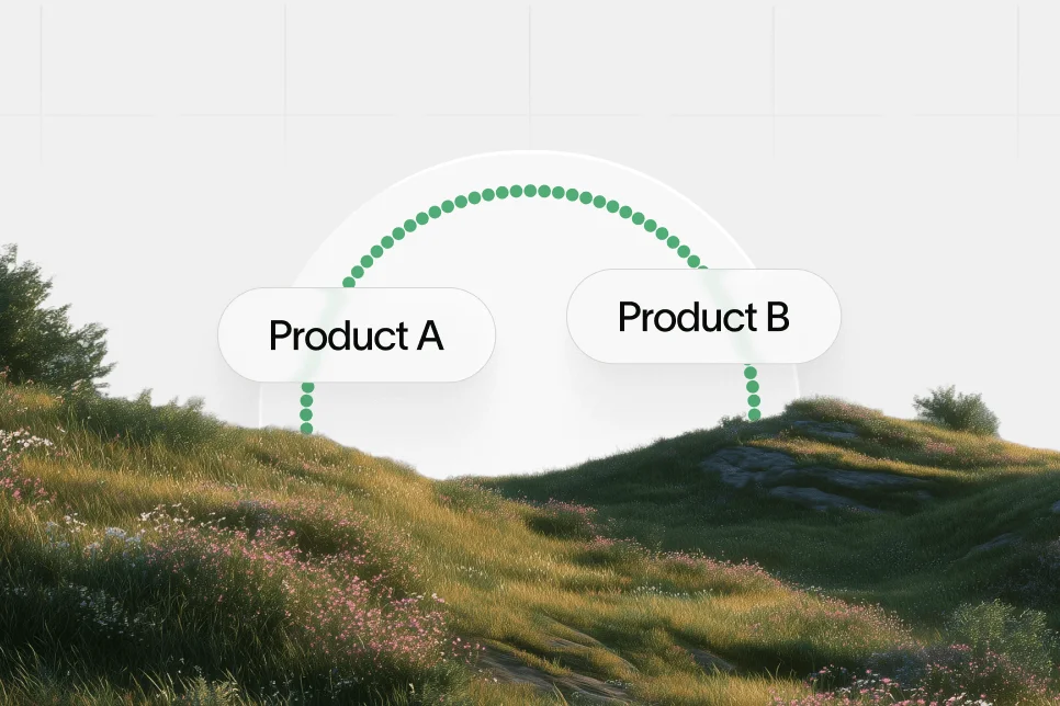
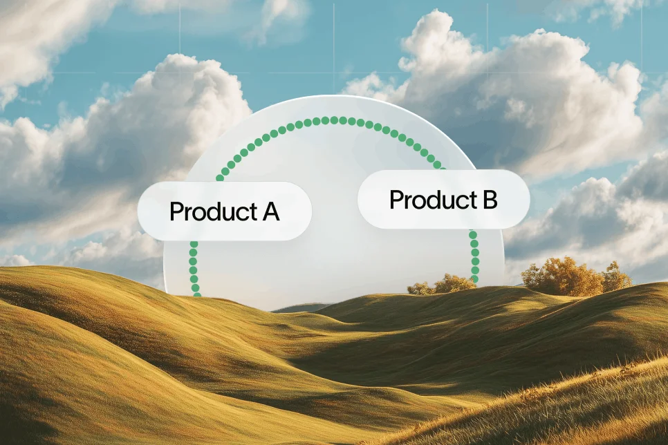
Good pattern: “Connect Product A and Product B to do X for Y team.”
Bad pattern: “Unlock productivity across your stack.”
2. Name real workflows, not vague benefits
List three to five workflows that describe the action and the outcome.
Good pattern: “Create a support ticket in Zendesk when a payment dispute appears in Stripe.”
Bad pattern: “Automate collaboration across departments.”
3. Surface friction before the visitor finds it later
Do not hide plan restrictions, setup ownership, or integration limitations. Putting those details higher on the page reduces unqualified clicks and improves trust.
4. Add proof that the page is maintained
Show a recent update date, current screenshots, active support language, or clear partner status. AI systems are more comfortable citing pages that look alive.
5. Give the page more than one next step
A single “Connect” CTA is too narrow for mixed intent traffic. Include a setup guide, use-case detail, and qualification path.
This same discipline also supports long-tail discovery. Teams building larger integration libraries often use programmatic structures, but those pages still need human-readable clarity. That is why a scalable template has to protect content quality, not just output volume, much like the page design principles in our guide to programmatic SEO.
Common mistakes that keep partner ecosystem pages invisible
Most poor-performing SaaS integration pages fail for repeatable reasons. The problem is rarely that the company lacks integrations. The problem is that the page does not expose their value clearly enough.
Mistake 1: Treating the page as a logo wall
A grid of logos can help browsing, but it is nearly useless for citation. Logos do not explain use cases, supported actions, or business value.
A better approach is to turn each important integration into a destination page with enough context to stand on its own.
Mistake 2: Writing copy that could fit any product
If the same text could appear on 50 other pages, it is too generic to rank or get cited. AI systems favor pages with distinct, reusable information.
Mistake 3: Sending every intent to the same CTA
Discovery traffic is mixed. Some people want to compare, some want to confirm compatibility, and some want to install. One CTA cannot serve all of them.
Mistake 4: Separating SEO from partner marketing
Integration pages often sit between teams: product marketing owns the narrative, partnerships owns the relationship, product owns the capability, and SEO is brought in late. That creates thin pages because no single team owns the complete information layer.
A stronger model combines all four inputs before publishing.
Mistake 5: Ignoring measurement beyond clicks
If the team only tracks pageviews, it will miss the actual role these pages play in AI search and revenue generation.
At minimum, track:
- search impressions
- click-through rate
- assisted conversions
- demo or signup rate by page
- partner-influenced pipeline
- AI citation visibility where possible
This is where AI visibility measurement becomes important. It is not enough to publish the page and wait. Teams need to see how often their brand appears in AI answers, which use cases get cited, and which pages are structurally invisible. That is part of the broader shift covered in these SaaS AI search lessons: visibility now depends on clear, citable content, not just content volume.
What to publish next if the current pages are thin
Teams do not need to rebuild the full marketplace at once. The better move is to sequence the work based on visibility potential and buyer intent.
Start with three buckets.
High-value integrations first
Prioritize integrations tied to revenue, onboarding, customer retention, or enterprise workflows. These pages tend to have stronger commercial intent and clearer use cases.
Examples include:
- CRM integrations
- support platform integrations
- billing integrations
- analytics integrations
- collaboration tool integrations
Then publish supporting comparison and workflow content
If the integration page answers “what this connection does,” nearby content can answer adjacent buying questions:
- Product A vs Product B for this workflow
- Best integrations for a specific team
- How to connect a tool stack for a specific use case
That surrounding content helps define the integration page’s relevance within a cluster and supports internal linking logic.
Then clean up the hub architecture
Once individual pages are strong, improve the integration directory. Group by use case, department, or outcome rather than alphabet alone.
A stronger IA might include:
- sales workflows
- support workflows
- onboarding workflows
- reporting workflows
- finance workflows
This gives both users and AI systems a clearer map of the ecosystem.
FAQ: What teams usually ask about SaaS integration pages
Why do SaaS integration pages struggle in AI search?
They usually lack structured context. Many pages rely on logos and generic copy, which gives AI systems too little information to summarize, trust, and cite.
Should every integration get its own page?
Not always, but every strategically important integration should. If an integration influences acquisition, expansion, or partner-led demand, it deserves a dedicated page with clear use cases and compatibility details.
What matters more: the marketplace hub or the individual page?
The individual page matters more for citation and ranking. The hub helps navigation, but AI systems often need a destination page with enough detail to answer a specific query.
How much content should an integration page include?
Enough to explain the integration without forcing the reader into documentation. In most cases, that means a clear summary, 3 to 5 workflows, setup expectations, limitations, and a relevant CTA path.
Do public integration pages need frequent updates?
Yes. Supported actions, UI patterns, pricing tiers, and partner relationships change often. A stale page is harder to trust and less likely to be cited.
Integration pages are no longer minor support assets. They are acquisition surfaces, qualification surfaces, and increasingly citation surfaces. Companies that treat SaaS integration pages as structured search assets, not gallery pages, will earn more visibility in both Google and AI answers.
For teams that want a clearer picture of where their pages stand, the next step is to measure which integration pages are discoverable, which ones are thin, and where AI visibility is missing. Skayle helps SaaS teams do that by connecting ranking work, content improvement, and AI answer visibility in one system.
References
- Rock The Rankings — SaaS Integration Pages: Structuring Pages for Conversions
- Powered by Search — 20 Examples of the Best SaaS Integrations Pages
- Nicelydone — SaaS Integration settings page design examples
- Amply — Top 9 SaaS Service Page Examples (Plus Breakdowns)
- SaaSpo — 55 SaaS Integrations page examples for design inspiration
- 15 Outstanding Integration Page Examples