TL;DR
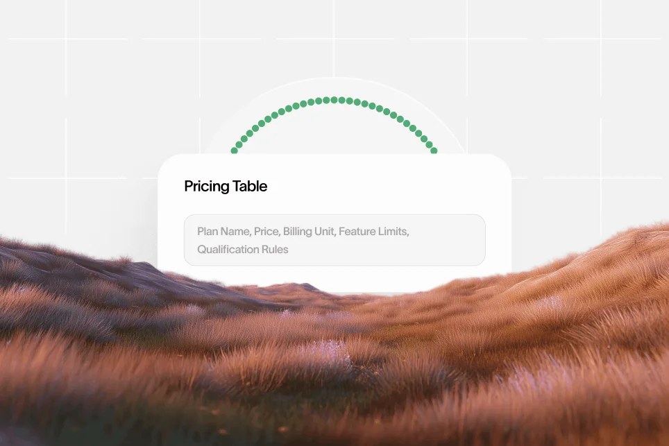
LLM-ready pricing tables make plan names, prices, units, limits, and qualifiers explicit enough for AI systems to extract and cite accurately. Clear visible structure matters more than flashy design, and schema works best when it confirms already readable pricing data.
Pricing pages now serve two audiences at once: human buyers and AI systems that summarize, compare, and cite vendor information. If pricing data is visually attractive but structurally messy, AI tools may misread plan names, omit limits, or skip the page entirely.
A pricing table is AI-readable when the plan names, prices, billing units, feature boundaries, and qualification rules are explicit enough for a machine to extract without guessing. That matters because the path to conversion increasingly runs through AI answer inclusion before the click ever happens.
Why pricing tables now influence both citations and conversions
Most SaaS teams still design pricing pages for direct visits only. That is outdated. In 2026, many buyers first encounter pricing through AI summaries, comparison assistants, internal procurement research, and agent-driven workflows.
This changes the page brief. A pricing table no longer exists only to persuade a person on a landing page. It also needs to survive extraction, comparison, and citation.
When that structure is weak, three problems show up fast:
- AI tools quote the wrong price because monthly and annual billing are blended together.
- Plan comparisons miss important limits because they are buried in tooltips or tabs.
- Buyers click through with the wrong expectation, which hurts conversion quality.
The business case is simple: a readable table reduces ambiguity before the visit and increases trust after the click.
According to Get LLM Ready’s pricing guidance, effective pricing tables need to differentiate features and prices clearly so users and agents can understand the offer. That principle is basic, but many pricing pages still break it with hidden qualifiers, vague labels, and inconsistent formatting.
There is also a market reason to care. Pricing information is increasingly being normalized for machine consumption, not just for visual display. For example, Vizra AI publishes real-time pricing data across 287+ models and supports programmatic access because budgeting tools and AI workflows depend on structured, current cost information.
The practical implication for SaaS teams is clear: if a pricing page cannot be extracted cleanly, it becomes less useful in AI-mediated discovery.
This is part of a broader shift in search. The same discipline that helps pages rank in search and appear in AI answers also applies to commercial pages. For teams thinking about that wider visibility layer, Skayle fits as a platform that helps companies rank higher in search and show up in AI-generated answers, especially when content quality, structure, and citation coverage need to be measured together.
The structural model that makes pricing data easier to cite
Most teams do not need a full redesign. They need a cleaner information model.
A practical way to think about llm-ready pricing tables is the five-part pricing citation model:
- Label: clear plan name
- Price: explicit amount and currency
- Unit: monthly, annual, per seat, usage-based, or hybrid
- Scope: what is included, limited, or excluded
- Qualifier: contract terms, minimums, custom pricing, or contact-sales conditions
If one of these five parts is unclear, extraction quality drops.
What AI systems struggle with most
AI tools are generally good at summarizing clean text. They are much worse at inferring pricing logic from design-heavy layouts.
Common failure points include:
- annual prices shown next to monthly labels
- custom plans listed without qualification criteria
- usage caps hidden behind hover states
- feature rows using vague wording like “advanced support” or “power features”
- plan names repeated in multiple places with slightly different labels
- prices rendered in images or scripts without a stable text equivalent
The issue is not that AI systems are incapable. The issue is that the page forces them to resolve ambiguity.
A contrarian but useful stance: do not start by adding more design flair to the pricing page; start by removing hidden logic. A visually impressive pricing table that depends on tabs, toggles, animation, and footnote puzzles often performs worse as a citation source than a plainer page with explicit plan boundaries.
What clean structure looks like in practice
A machine-readable pricing section should answer these questions without cross-referencing another page:
- What is each plan called?
- How much does it cost?
- In what billing unit?
- Who is it for?
- What are the key included features?
- What limits apply?
- When does someone need to talk to sales?
If a buyer or AI assistant has to infer any of those, the page is under-structured.
For adjacent context on how search itself is changing, Skayle has covered what SEO means now in a way that maps well to this shift from ranking pages to building citation-ready assets.
How to build llm-ready pricing tables step by step
This is where most teams can make measurable improvements without touching product packaging.
Step 1: Normalize the pricing language
Use one format for all monetary values. If the page mixes “$29,” “$29/month,” “starting at $29,” and “$348 billed annually,” both buyers and AI tools have to reconcile the logic themselves.
Pick one canonical presentation for each plan:
- currency
- amount
- billing frequency
- seat or usage basis
- annual discount if applicable
For usage-based or token-based pricing, unit normalization is even more important. As shown in Superorange’s Dev.to comparison table, “USD per 1M tokens” has become a standard baseline for comparing model costs. The lesson for SaaS pricing is broader: use a stable unit that makes side-by-side comparison obvious.
If a company charges per workspace, per user, and per usage event, that complexity should be spelled out in plain text. AI tools handle explicit mixed models better than implied ones.
Step 2: Separate plan facts from persuasion copy
Pricing pages often mix commercial copy with plan data in the same row. That creates noise.
A cleaner pattern is:
- one short line for who the plan is for
- one explicit price line
- one compact list of included capabilities
- one compact list of limits or thresholds
- one qualifier line for billing conditions or contract requirements
This does not make the page less persuasive. It makes the persuasion easier to trust.
A simple before-and-after example:
Before
- Growth plan
- Best for scaling teams
- From $99
- Powerful automation
- Unlimited projects*
The asterisk leads to a footnote below the fold saying unlimited means up to 25 active automations and excludes certain workflows.
After
- Growth
- $99 per workspace per month, billed monthly
- For teams managing up to 25 active automations
- Includes workflow builder, reporting dashboard, and email support
- Additional automations available on annual and custom plans
The second version gives AI tools something extractable and gives buyers fewer surprises.
Step 3: Use semantic HTML before worrying about schema
Schema helps, but schema cannot fix a badly structured page.
The visible page should already use sensible hierarchy:
- one pricing section with a clear heading
- distinct plan cards or columns
- plan names in headings, not stylized spans only
- feature comparisons in real text
- limits and exclusions in visible text
- billing toggle states reflected in crawlable content
This is where many teams make the wrong tradeoff. They rely on JavaScript-heavy interfaces that are elegant in demos but fragile in extraction.
If monthly and annual pricing are toggled, the safest approach is to ensure both states are represented clearly in the DOM or on dedicated URLs, rather than assuming every system will interpret the toggle correctly.
Step 4: Add structured data that supports the page, not replaces it
Once the visible content is stable, structured data can reinforce meaning.
For SaaS pricing, the goal of schema is not to stuff more markup onto the page. The goal is to help search engines and downstream systems understand what the page already says.
Useful markup typically includes product and offer-level signals such as:
- product or service name
- price
- price currency
- offer category or plan context
- availability or contact-sales status
- billing description in plain language where appropriate
The important point is consistency. If the visible page says one thing and the markup says another, the markup loses credibility.
For non-technical teams, the rule is simple: schema should confirm, not translate. If a human cannot understand the pricing quickly, structured data alone will not rescue the page.
Step 5: Make qualification logic explicit
Many B2B pricing pages break at the enterprise tier. The self-serve plans are clear, then the highest-value plan becomes a catch-all box labeled “Custom” with no meaningful information.
That is bad for both conversion and citation.
A better pattern is to define what drives custom pricing:
- seat volume threshold
- API or usage volume threshold
- security or compliance requirements
- onboarding or support requirements
- multi-brand or multi-region needs
This tells buyers when the self-serve pricing stops applying. It also tells AI tools when not to hallucinate a number.
Step 6: Publish update signals and version discipline
Pricing freshness matters. Buyers distrust pages that look stale, and AI systems can amplify old information if the page lacks clear update discipline.
This does not mean the page needs a giant timestamp in the hero. It means the company should maintain stable labels, consistent units, and visible update logic when pricing changes.
This is especially relevant in categories with fast-moving cost structures. According to Mobisoft Infotech’s pricing guide, standardized units are essential for comparison, particularly when price models change across providers. The same logic applies to SaaS pricing pages that use bundles, usage tiers, or variable overages.
The page design choices that help or hurt AI readability
Design still matters. It just needs to serve clarity first.
Use comparison layouts that machines can follow
The most reliable pricing layouts share a few traits:
- identical row structure across plans
- visible feature names
- direct yes/no or included/not included states
- numeric limits where possible
- plain-language footnotes directly under the relevant feature
A comparison table can still look polished. The difference is that each row maps to a stable concept.
Zuplo’s pricing strategy article discusses how AI can help generate clearer tiers and comparison reasoning. From the reverse angle, that same clarity is what helps AI systems read and compare pricing pages accurately.
Avoid hidden content as the primary source of truth
Tooltips, accordions, and hover states are useful for reducing clutter, but they should not hold core pricing facts.
If a critical limit only appears when someone hovers over an icon, that limit is weakly represented. The same goes for scrollable mini-tables inside cards or pricing details embedded in images.
The rule is practical: core plan facts should be visible as text on load or available on a stable linked detail page.
Keep labels boring on purpose
This is one of the least popular but most useful fixes.
Marketing teams often rename pricing concepts to sound differentiated. That can hurt parseability. Terms like “product power,” “advanced scale,” or “growth intelligence” may sound polished, but they do not map cleanly to buyer needs or AI extraction.
Prefer straightforward labels such as:
- users included n- projects included
- support level
- data retention
- integrations
- usage limit
- setup fee
Clear labels compress better into AI answers and procurement notes.
A practical checklist for auditing an existing pricing page
Most teams can audit their current page in under one hour.
- Copy the visible pricing text into a plain document and remove all design.
- Check whether each plan still makes sense without color, layout, and icons.
- Confirm that every plan has a name, price, unit, scope, and qualifier.
- Verify that monthly and annual numbers cannot be confused.
- Replace vague feature names with plain-language descriptions.
- Move critical footnotes closer to the relevant plan or row.
- Make custom pricing triggers explicit instead of generic.
- Ensure visible text and schema describe the same commercial offer.
- Test the page with internal teams by asking for a one-line summary of each plan.
- Review analytics after changes to see whether pricing-page exits, assisted conversions, and sales-call qualification improve.
A proof-oriented measurement plan
Hard public benchmarks for pricing-table AI readability are limited, so teams should measure their own improvement with a simple baseline.
A practical test looks like this:
- Baseline: current pricing page with mixed units, hidden qualifiers, and vague feature rows
- Intervention: normalize pricing language, expose limits in visible text, tighten comparison rows, and align structured data with the page copy
- Expected outcome: fewer pricing clarification questions in sales calls, cleaner AI-generated summaries in prompt testing, and better match quality on demo or trial conversions
- Timeframe: 30 to 45 days after publishing changes
- Instrumentation: track pricing-page conversion rate, assisted conversions, sales-call objection notes, and prompt-based extraction tests across major AI tools
This is the right level of rigor when no universal benchmark exists. It also avoids fake certainty.
For teams already refreshing content to recover visibility, the same discipline applies to commercial pages. Skayle’s work on AI Overviews recovery is relevant because extractable structure and clearer authority signals often matter as much as new net-new content.
Where tools fit if a team wants to operationalize this work
Some teams can handle pricing-page cleanup internally. Others need workflow support across SEO, content, and AI visibility.
Below is the practical split.
Skayle
Website: Skayle
Skayle fits teams that want pricing pages, product pages, and supporting content to work as part of the same ranking and AI visibility system. It is best suited to SaaS companies that do not want SEO execution, content updates, internal linking, and AI answer visibility to live in separate tools.
The tradeoff is that Skayle is not a narrow pricing-page widget. It is a broader platform for companies that want to improve how they rank in search and appear in AI answers, then maintain that visibility over time.
Vizra AI
Website: Vizra AI
Vizra AI is relevant as an example of machine-consumable pricing data published at scale. Its documentation demonstrates what current, structured pricing access looks like when the use case depends on comparison and budgeting across many options.
The tradeoff is category fit. It is a strong reference model for data delivery, but not a general SaaS SEO or commercial-page optimization platform.
Get LLM Ready
Website: Get LLM Ready
Get LLM Ready is useful as a conceptual benchmark for how pricing tables should clearly separate plans, features, and prices for better readability. It is best used as directional guidance when a team wants to audit the clarity of a pricing table.
The tradeoff is that conceptual guidance alone does not fix underlying page architecture, content operations, or visibility tracking.
Common pricing-page mistakes that break AI citations
The same issues appear repeatedly across SaaS sites.
Mixing billing logic in one visual layer
A plan shows “$99” in large text, then “billed annually” in faint text, then a monthly equivalent in a tooltip. That design may look clean, but it creates extractable ambiguity.
Fix it by making the canonical charge explicit in one line.
Treating enterprise pricing as a black box
“Contact sales” is not the problem. Zero qualification detail is the problem.
Fix it by stating who needs custom pricing and why.
Letting footnotes carry the important truth
If the asterisk holds the actual limit, the pricing card is incomplete.
Fix it by pulling the core constraint into the main row or plan description.
Using design tokens instead of plain language
Badges, icons, and labels like “premium intelligence” may help brand expression, but they often hide the real commercial difference.
Fix it by translating branded language into operational language.
Forgetting that AI answers are part of the funnel
The old funnel started with a click. The current one often starts with an AI answer, followed by a citation, then a visit.
That means pricing pages should be designed for this path: impression, AI answer inclusion, citation, click, conversion. Teams that ignore the citation step leave commercial visibility to chance.
For content teams trying to improve citation quality broadly, this discipline also reduces the risk of low-trust output described in our guide to avoiding AI slop.
FAQ: the details teams usually ask about
Does schema alone make a pricing table AI-readable?
No. Schema helps machines confirm structured facts, but it cannot compensate for unclear visible content. The page still needs explicit plan names, pricing units, limits, and qualifiers in readable text.
Should monthly and annual pricing live on the same page?
Yes, if the distinction is unmistakable. If the page makes users or AI tools infer which number is canonical, separate URLs or clearer state handling may be safer.
How much detail should a custom plan include?
Enough to explain when someone needs it. Good custom-plan sections describe triggers such as seat count, compliance needs, usage volume, onboarding scope, or support requirements.
Are feature comparison tables better than pricing cards for AI citations?
Usually, yes, when the rows are consistent and the labels are explicit. Cards are fine for top-level packaging, but tables often provide better extraction structure for side-by-side comparisons.
What should teams measure after changing a pricing table?
Start with pricing-page conversion rate, sales-call pricing objections, and prompt-based extraction accuracy in major AI tools. Over 30 to 45 days, those signals show whether clarity improved before the team looks for larger revenue effects.
A pricing page should not force buyers or AI systems to guess what the product costs, what each plan includes, or when custom terms apply. The companies that win more citations are usually not the ones with the flashiest design. They are the ones with the clearest commercial structure.
For teams that want to connect pricing-page clarity to a broader ranking and AI visibility system, Skayle helps measure AI visibility, strengthen citation coverage, and keep commercial pages aligned with how search is changing.