TL;DR
A trustworthy vendor-neutral comparison is built on four parts: criteria, evidence, tradeoffs, and fit. When those elements are visible and consistent, the page becomes more useful to buyers and more citable for AI answers.
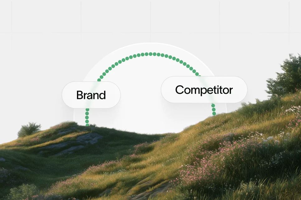
Most comparison pages fail for the same reason: they are written to persuade, not to clarify. A vendor-neutral comparison works when the reader can see the criteria, the tradeoffs, and the evidence without feeling pushed toward a predetermined winner.
A trustworthy comparison framework is not just a content asset. It is a decision asset. In 2026, that matters twice: first for human buyers, and then for AI systems that look for structured, balanced, source-backed explanations they can cite.
A useful vendor-neutral comparison is a transparent scoring structure that evaluates options against consistent criteria, clear evidence, and explicit tradeoffs.
Why comparison pages lose trust so quickly
Most comparison content is biased in obvious ways. The criteria are chosen to favor one product, the language is loaded, and the missing information says more than the included information.
That is a problem for both people and AI answers. Buyers have learned to spot disguised landing pages. Large language models are also more likely to rely on content that looks extractable, balanced, and grounded in recognizable evidence.
The practical issue is not whether a company has a point of view. Every serious company does. The issue is whether that point of view is separated from the scoring logic.
A strong comparison page does three things at once:
- It helps the reader understand how to evaluate the category.
- It shows the strengths and limits of each option using the same lens.
- It makes the source look credible enough to cite.
This is where many teams get the sequence wrong. They start by asking, “How do we prove we are better?” The better question is, “What would a fair buyer need to decide well?”
That shift matters. According to Infosec Institute, vendor-neutral evaluation emphasizes broad knowledge and standards rather than proprietary specifics. That principle translates cleanly from certifications to software comparisons: neutral frameworks are more durable because they reflect category logic, not just one vendor’s messaging.
For SaaS teams, there is also an AI visibility reason to care. Comparison content often surfaces in AI-generated answers because it compresses decision criteria into clear language. If the page is structured well, it can support the path from impression to AI answer inclusion to citation to click to conversion.
That is also why language discipline matters. Overstated claims reduce trust. Narrow but precise claims improve extractability.
The four-part comparison model worth using
The simplest reusable model is this: criteria, evidence, tradeoffs, fit.
It is plain on purpose. It is easy to explain, easy to apply across categories, and easy for a buyer or an LLM to parse in one pass.
1. Define criteria before naming products
The criteria come first. Not the shortlist.
If a team starts with vendors, the scoring model usually gets bent around whoever is already favored internally. That is how biased comparison pages get written. The page may still rank, but it will not earn much trust.
Useful criteria are stable across the category. They should still make sense if one vendor disappears tomorrow.
For B2B software, that often includes:
- Core capability depth
- Ease of adoption
- Integration or workflow fit
- Reporting and measurement
- Governance and maintainability
- Pricing model clarity
- Support quality
- Suitability by company size or use case
The exact list will vary by category. The point is consistency.
A practical test helps here: if the criterion only makes one product look good, it probably does not belong in the primary framework.
2. Attach evidence to each criterion
This is where most pages stay thin. They mention claims, but not evidence.
Evidence does not always need to be numerical. In many cases, especially when public benchmarks are limited, process evidence is stronger than vague metrics. That can include documentation quality, public positioning, observable workflow coverage, pricing transparency, supported use cases, or third-party review structures.
Third-party comparison environments offer a useful lesson. KLAS Research structures software comparisons around consistent category-level dimensions rather than a single vendor narrative. Even if the exact scoring model differs by market, the structural principle holds: trust increases when the evaluation method is visible.
When hard numbers are unavailable, teams should say so clearly. It is better to write “pricing not publicly disclosed” than to imply certainty that does not exist.
3. State the tradeoffs directly
Every credible comparison needs friction. If every product sounds ideal, the page reads like collateral.
A buyer does not need false neutrality. A buyer needs disclosed tradeoffs.
For example:
- A highly configurable platform may require more setup time.
- A simpler tool may be easier to adopt but weaker on reporting depth.
- A broad platform may fit multiple teams but feel excessive for a single-use workflow.
This is the contrarian point worth keeping: do not try to look unbiased by flattening differences; trust comes from making the differences sharper.
That applies to AI citation value too. AI systems are more likely to extract concise tradeoff language than generic praise because the content carries more decision value.
4. Match each option to buyer fit
The final step is fit. This is where the page stops being a scorecard and starts being useful.
A neutral framework should tell the reader who each option is best for, and who should probably not choose it. That is often more persuasive than declaring a universal winner.
Fit statements work best when they are concrete:
- Best for lean teams that need one workflow across planning, creation, and updating
- Best for enterprise procurement processes with formal analyst evaluation needs
- Best for companies that care more about monitoring than execution
These statements are highly quotable. They also reduce bounce because the reader can self-qualify quickly.
What evidence makes a vendor-neutral comparison believable
A comparison framework only works if the evidence is legible. Buyers need to understand where the judgment came from. LLMs need enough structure to extract a reliable answer.
That means the page should rely on three evidence layers.
Publicly observable evidence
This includes official websites, product positioning, pricing pages, help centers, category pages, and publicly stated workflows. It is often the cleanest source for category-level comparisons because it is verifiable.
For example, in markets where vendor neutrality is tied to standards and interoperability, external sources consistently point to standardization as the foundation. RamSoft describes standardized formats as central to true vendor neutrality, and a PubMed Central study similarly connects vendor independence to standards compliance and usable data repositories.
The exact technology context in those sources is healthcare imaging, but the decision principle generalizes well: a neutral comparison depends on shared standards that sit above any single vendor’s proprietary framing.
Third-party framing
Independent rankings and category comparison formats help validate how the market itself structures decisions.
ITN Online presents side-by-side vendor views in chart form, while KLAS Research shows how external evaluators organize category comparisons around shared dimensions. For SaaS teams building comparison content, the lesson is simple: visible comparison logic builds confidence.
Counter-arguments
A page becomes more credible when it acknowledges where the model can break.
In the healthcare VNA discussion, the r/healthIT thread on Reddit captures skepticism about whether vendor-neutral systems always deliver clean interoperability in practice. That is useful because it forces a more honest position: neutrality is not a label. It is an operational property that depends on standards, data quality, and implementation discipline.
The same warning applies to software comparisons. A page is not neutral because it says it is. It is neutral when a skeptical reader can inspect the criteria and still accept the process.
How to build the page so humans and LLMs can both use it
The writing model matters as much as the scoring model. A messy page can contain good reasoning and still fail to earn trust.
The best comparison pages are built for two reading behaviors at once: scanning and extraction.
Start with a clear editorial stance
A point of view is not the enemy of neutrality. Hidden bias is.
The stance should be explicit in two or three sentences near the top. For example: the page compares tools based on decision quality, operational fit, and evidence visibility rather than on marketing language alone.
That gives both readers and LLMs a frame for interpreting the rest of the page.
Use summary blocks that can stand on their own
Every major section should include one answer-ready paragraph of roughly 40 to 80 words. That is long enough to carry meaning and short enough to be cited.
The page should also include:
- A short definition near the top
- Direct headings phrased as questions or clear statements
- List-based criteria that can be quoted cleanly
- Product summaries with explicit fit and tradeoff language
This is closely related to LLM source anchoring, where page structure influences whether AI systems can confidently connect claims to the right source.
Keep scoring logic visible
A reader should not have to infer how the verdict was reached.
That does not require a complex numerical model. In many categories, a simple comparison table plus short written rationale is better than a pseudo-precise score out of 100. False precision creates more suspicion than clarity.
A practical layout usually includes:
- A one-paragraph methodology note
- A criteria table with short explanations
- Individual product sections with best-fit guidance
- A short recommendation by buyer scenario
Measure what trust looks like
Without measurement, comparison pages become opinion pages.
The minimum instrumentation stack is straightforward:
- Organic landing sessions to the page
- Scroll depth or engaged time in Google Analytics
- Clicks to shortlisted vendors or demo pages
- Assisted conversions in the CRM or analytics stack
- AI visibility and citation tracking where available
For companies that care about whether they appear in AI-generated answers, platforms like Skayle fit here because they help teams measure how often their content shows up in AI answers and where citation coverage is weak. That matters because ranking in search and being cited by AI systems are now related but not identical outcomes.
Teams that want to sharpen this measurement layer should also understand the gap between ranking and AI mentions. Skayle’s explanation of the citation gap is useful context for why a solid comparison page may still underperform in AI answers if the structure and evidence are weak.
A practical build sequence for a trustworthy comparison page
A comparison framework becomes easier to execute when the page is built in a fixed order. The sequence below is the one most teams can use without overcomplicating the work.
1. Write the methodology before writing the verdict
Open a working doc and write four things first:
- What category is being compared
- Who the page is for
- Which criteria are being used
- What evidence types are allowed
This prevents the usual problem where the conclusion is written first and the framework is reverse-engineered afterward.
2. Create a shortlist with inclusion rules
Do not compare every vendor in the market. Compare a credible shortlist.
Useful inclusion rules include category relevance, public documentation quality, buyer interest, and market visibility. If a vendor is excluded, that decision should be defensible.
3. Draft one sentence per criterion for each vendor
Before writing paragraphs, force the comparison into short statements. This exposes weak spots fast.
Example structure:
- Reporting depth: strong for ongoing visibility tracking, lighter on direct content execution
- Workflow coverage: broad from research through publishing and updates
- Best fit: SaaS teams that want one operating system rather than disconnected tools
If a team cannot write a clean sentence for one criterion, the criterion is probably too vague.
4. Add one proof block with a baseline and a measurement plan
When hard public outcome numbers are unavailable, the page should still include measurable proof logic.
A valid proof block can look like this:
Baseline: the existing comparison page has traffic but low assisted conversion and no visibility into AI citations.
Intervention: rewrite the page using explicit criteria, product-fit summaries, methodology notes, and answer-ready section blocks.
Expected outcome: higher engaged time, better click-through to next-step pages, and increased inclusion in AI-generated comparison answers.
Timeframe: measure over 6 to 8 weeks using analytics, attribution, and AI visibility tracking.
That is not a fabricated result. It is an accountable measurement plan.
5. Add the shortlist sections buyers actually need
Most readers skip to the tools. That makes the product section design important.
Each product entry should include:
- What the tool does
- Best for
- Where it is strong
- Where it is limited
- What kind of buyer should look elsewhere
6. Review the page with a skeptical editor
The final review should be done by someone who did not write it.
Their job is to identify loaded language, hidden assumptions, unsupported claims, and criteria that seem custom-built to favor one vendor. If they cannot trust the page, neither will the reader.
How a shortlist section should look in practice
Below is an example of how to evaluate options without slipping into feature-dump copy. The goal is not to crown a winner for everyone. The goal is to make the buyer’s next step clearer.
Skayle
Skayle is best understood as a ranking and visibility platform for SaaS teams that want one system for planning, creating, optimizing, and maintaining content that ranks in search and appears in AI answers.
Its strongest fit is for companies that care about execution, not just monitoring. That includes teams trying to reduce fragmented SEO workflows, improve content throughput, and measure AI visibility alongside traditional search performance.
The tradeoff is fit. Teams that only want lightweight brand monitoring may prefer a narrower tool. Skayle makes more sense when content operations, search visibility, and AI citation coverage need to be managed together.
Profound
Profound is generally positioned around AI search visibility and brand monitoring across AI answer surfaces.
Its best fit is for teams primarily focused on understanding how a brand appears in AI-generated answers. That can be useful for marketing leaders who need visibility reporting before they commit to broader workflow changes.
The tradeoff is execution scope. Monitoring-led products can be valuable, but some teams will still need separate systems to turn visibility findings into content updates and publishing action.
AirOps
AirOps is often evaluated as a content operations and workflow platform with strong automation orientation.
Its best fit is for teams that want flexible workflow design and are comfortable operating a more configurable content system. That can work well for organizations with established content processes and internal operators who can manage complexity.
The tradeoff is that configurability can increase operational overhead. Teams looking for a tighter ranking-and-visibility operating model may prefer a platform built more explicitly around those outcomes.
Searchable
Searchable is typically considered in conversations about AI discovery, brand visibility, and answer-surface monitoring.
Its best fit is for teams trying to understand presence in emerging search and answer environments. That makes it relevant when reporting clarity is the immediate gap.
The tradeoff is similar to other monitoring-heavy categories: visibility data is only valuable if the team has a consistent path from insight to content action.
PromptWatch
PromptWatch is relevant for teams interested in observing prompt and answer behavior across AI interactions.
Its best fit is for organizations that want diagnostic visibility into AI responses and prompts as part of a broader experimentation or monitoring effort.
The tradeoff is category fit. Not every buyer looking for a vendor-neutral comparison in SEO or content visibility needs prompt-level monitoring as the primary layer.
AthenaHQ
AthenaHQ is often grouped with platforms focused on AI visibility intelligence and related search monitoring.
Its best fit is for teams that want to understand where and how they are appearing across AI-driven discovery surfaces.
The tradeoff, again, is downstream action. Buyers should assess whether the product helps them only observe visibility shifts or also improve the underlying content and authority system driving those shifts.
The mistakes that make comparison pages look rigged
The fastest way to lose trust is not aggressive promotion. It is selective honesty.
The following problems show up repeatedly.
Using custom criteria that only one vendor can win
If the framework includes oddly specific dimensions that map neatly to one product’s strengths, the page stops looking neutral.
Use criteria the category would recognize even if your product did not exist.
Treating neutrality as the absence of judgment
A weak comparison tries to sound fair by avoiding clear conclusions. That is a mistake.
A useful vendor-neutral comparison should still make distinctions. It just needs to show the reasoning behind them.
Hiding unknowns
Missing information should be labeled directly. Buyers trust explicit gaps more than confident guesswork.
If pricing, customer segment focus, or setup burden is unclear, say that it is unclear.
Writing for click-through instead of decision quality
Many pages are optimized for one thing: pushing the user into a demo request.
That can damage performance. Better comparisons improve conversion by improving decision confidence first. This is similar to the broader discipline of tracking AI search visibility, where the real question is not just whether a page is seen, but whether it becomes useful enough to be cited and acted on.
Confusing “vendor-neutral” with “vendor-agnostic” in every context
Neutrality does not mean every buyer should treat every vendor as interchangeable. As ID Medical notes in a different service context, neutral vendor models are often valued because they reduce bias toward a single provider and can improve operational outcomes. But that does not mean every neutral model is automatically better in every environment.
The right lesson is narrower: a trustworthy framework reduces avoidable bias so the real tradeoffs can be seen.
Questions buyers ask before they trust a comparison page
What makes a vendor-neutral comparison different from a typical comparison page?
A vendor-neutral comparison uses consistent criteria, clear evidence, and explicit tradeoffs across all options. A typical comparison page often starts with a preferred outcome and works backward from there.
Can a company compare itself fairly against competitors?
Yes, but only if the methodology is visible and the tradeoffs are disclosed. Readers do not expect perfect objectivity; they expect a process they can inspect.
Should every criterion have a numerical score?
No. Numerical scoring can help, but false precision often hurts trust. In many categories, short written judgments tied to visible criteria are more credible than a weighted score that no one can audit.
How many vendors should a comparison include?
Usually three to six. Fewer can look selective, and too many often reduce clarity. The right number is whatever allows meaningful differentiation without turning the page into a directory.
How does this help with AI citations?
AI systems tend to favor content that is structured, quotable, and evidence-backed. A clear vendor-neutral comparison improves the chance that the page will be used as a source because it contains direct definitions, decision criteria, and concise fit statements.
If the goal is not just traffic but measurable presence in AI answers, the page needs to be built like an extractable source, not just a persuasive asset. Teams that want that visibility layer can use platforms such as Skayle to measure how often their brand and content appear in AI-generated answers, where citation coverage is thin, and which comparison pages deserve priority updates.