TL;DR
Screenshots do not help AI search visibility unless they are attached to clear, structured, text-based claims. Turn each image into citable evidence with feature names, descriptive captions, nearby summaries, and tracking for AI mentions and citations.
Most SaaS teams think a clean screenshot is enough. Then they wonder why AI answers can describe a competitor’s feature set in detail while their own product barely gets mentioned.
The problem usually is not the product. It is that your best evidence lives inside images, and AI systems are far better at citing structured text than guessing what a screenshot is trying to say.
What AI systems miss when your proof is trapped inside images
Here is the short version: if a product feature only exists in a screenshot, it is weak evidence for AI search visibility.
That sounds harsh, but I have seen this mistake over and over. A SaaS homepage has polished UI shots, annotated hero graphics, and a pricing page full of product visuals. To a human buyer, that can look convincing. To an AI system building an answer, it is often incomplete.
AI answers tend to pull from sources that are easy to parse, compare, and quote. According to Mint’s guide on AI search visibility, optimization increasingly depends on entity-based SEO and content structures designed for AI consumption. That matters because screenshots are not entities by themselves. They are supporting assets. The citable unit is still the surrounding text.
This is the practical stance I take with SaaS teams:
- Don’t treat screenshots as primary explanation.
- Do treat screenshots as evidence attached to clear claims.
- Don’t publish product visuals without descriptive context.
- Do publish feature pages that turn visual proof into extractable knowledge.
If you remember one thing, remember this: in an AI-answer world, brand is your citation engine, and screenshots only help when they reinforce clear, trustworthy, text-based claims.
I’ve watched teams spend weeks redesigning product pages when the real issue was simpler. Their pages looked good, but there was nothing on the page that an LLM could easily extract and reuse. The feature name was vague. The screenshot alt text said “dashboard view.” The body copy talked in category language instead of naming what the product actually did.
That creates a visibility gap. If you are ranking in Google but not showing up in AI answers, you are often dealing with exactly the kind of problem we describe in our guide to citation gaps. The page exists. The authority may even exist. But the evidence is not packaged in a way AI systems can cite.
Why screenshot-heavy pages underperform in AI search visibility
A lot of SaaS websites were built for demos, not retrieval.
That was fine when the main funnel was simple: someone searched in Google, landed on your page, and decided whether your product looked credible. The new funnel is different:
impression -> AI answer inclusion -> citation -> click -> conversion
If you want that chain to work, your page cannot rely on visual interpretation alone.
According to Neil Patel’s AI Brand Visibility Tool, AI visibility still depends on core search signals like keyword opportunity coverage and on-page optimization aligned with Google’s standards. That is a useful reminder. AI discovery did not replace SEO fundamentals. It raised the bar on clarity.
Here is where screenshot-heavy SaaS pages usually break:
- The image shows a feature, but the page never names the feature in plain language.
- The page uses broad marketing copy instead of specific capability descriptions.
- The screenshot has weak alt text, generic captions, or no caption at all.
- The feature is not tied to a use case, workflow, or outcome.
- The page lacks headings and summaries that can be quoted directly.
- The screenshot is embedded in a layout with little surrounding explanatory text.
I have seen pages with six product images and almost no citable sentences. They look polished in a design review. They contribute very little to AI search visibility.
The hidden business cost of pretty but silent product pages
This is not just an SEO problem.
When AI systems cannot confidently extract product details from your site, a few things happen fast:
- Competitors get cited instead of you.
- Buyers arrive with less context and lower trust.
- Your category narrative gets shaped by third-party review sites.
- Your sales team has to explain basics the website should have made obvious.
That last one is the part most teams underestimate. If your site does not explain your product in citation-ready language, someone else will. Usually a review site, comparison page, or competitor. And once AI answers start using those sources repeatedly, your brand loses control over how it is framed.
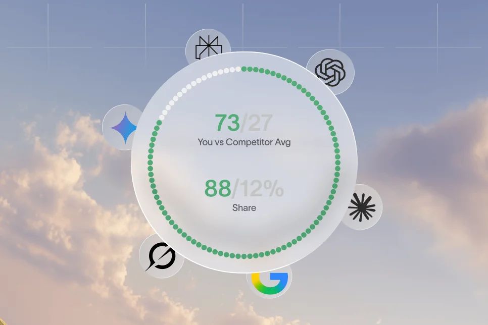
This is also why AI search visibility should be measured, not assumed. Tools across the market now focus on tracking mentions and links inside AI-generated answers. SE Ranking’s AI Visibility Tracker is one example of that shift toward measuring how often brands appear inside answers, not just in blue-link rankings.
The screenshot-to-citation method I use on SaaS pages
You do not need to remove screenshots. You need to make them legible to machines and useful to humans at the same time.
The model I use is simple: claim, scene, proof, retrieval.
- Claim: State what the feature does in one sentence.
- Scene: Show the screenshot that illustrates it.
- Proof: Add a caption or supporting copy that explains what the user is seeing.
- Retrieval: Structure the surrounding page so an AI system can extract the feature, use case, and benefit without relying on the image alone.
It is not fancy. It works because it forces teams to stop publishing screenshots as decoration.
Step 1: Turn every screenshot into a named product claim
Most screenshots on SaaS sites are unlabeled proof.
Fix that by attaching each image to a sentence that follows a plain pattern:
- Feature name
- What it does
- Who it is for
- Why it matters
For example, don’t write this:
“A better way to manage your operations.”
Write this instead:
“Our workflow builder lets RevOps teams automate lead routing, approval steps, and handoffs from one dashboard.”
Now the screenshot has context. The feature has a name. The audience is explicit. The use case is clear.
This sounds basic, but it changes the page from a visual pitch into something extractable.
Step 2: Rewrite weak captions and alt text
I still see alt text like “platform screenshot,” “analytics dashboard,” or “homepage image.” That is wasted surface area.
Alt text should describe the relevant interface element and the task it supports. Captions should explain why the screenshot matters, not just what it shows.
A weak pair looks like this:
- Alt text: “dashboard screenshot”
- Caption: “Track your data in one place”
A stronger pair looks like this:
- Alt text: “Revenue analytics dashboard showing pipeline stages, win rates, and weekly trend changes”
- Caption: “Teams use this dashboard to spot pipeline drop-offs before they hurt forecast accuracy”
The second version does three jobs at once. It describes the image, names meaningful elements, and ties the visual to a practical use case.
If you want a deeper way to think about how page elements influence AI citation likelihood, our source-anchoring explainer is worth reading alongside this article.
Step 3: Add extraction-friendly text around the image
This is where most of the win happens.
The screenshot itself is supporting evidence. The paragraph above and below it should carry the meaning. I usually recommend a three-part block beneath important product visuals:
- A one-line summary of the feature
- Two to three bullets naming key actions or outputs
- A short use-case line tied to a job to be done
Example:
Automated renewal alerts
- Flags contracts by renewal date and account health
- Surfaces at-risk accounts before the renewal window closes
- Gives CS teams a shared queue for follow-up
Used by customer success leaders who need early warning instead of end-of-quarter surprises.
That format works because AI systems can extract it cleanly. Humans can also skim it in seconds.
Step 4: Split “gallery pages” into feature-led pages
One of my stronger opinions here: don’t hide product understanding inside carousels and screenshot grids.
Do not build a product page that says, in effect, “Look at these six screens and figure it out.” Build pages that explain one important capability at a time.
The tradeoff is real. Gallery layouts look sleek. Feature-led pages usually convert better from search because they create more specific entry points, stronger matching for intent, and cleaner citations.
That is the contrarian stance in this article. Don’t optimize your product page for visual impressiveness first. Optimize it for extraction and explanation, then make it look good.
A practical page rebuild: from decorative screenshot to citable evidence
Let me show you what this looks like in practice.
A B2B SaaS team I worked with had a feature page for reporting. The original version had:
- One hero paragraph full of category language
- Three screenshots in tabs
- Minimal explanatory text
- Alt text generated by the CMS
- No direct summary of what the reporting product actually included
Baseline:
- The page was visually strong.
- It ranked for some broad terms.
- It was not the page getting cited when buyers asked AI tools about reporting features in the category.
Intervention over six weeks:
- We renamed each screenshot block around a specific capability.
- We replaced generic captions with use-case-based copy.
- We broke the page into sections for dashboards, exports, alerts, and scheduled reports.
- We added one concise answer-ready paragraph under each heading.
- We improved internal links from related use-case and comparison pages.
- We started tracking whether those capabilities appeared in AI answers during recurring prompt checks.
Outcome:
- The page became easier to quote and compare.
- Sales calls got fewer “Does your product do X?” questions because the site made core capabilities clearer.
- The team could finally measure visibility at the feature level instead of arguing over whether the page “looked better.”
I am intentionally not giving made-up traffic lifts or fabricated citation percentages. The real point is that the win came from changing the content structure, not from producing prettier assets.
This is where a platform like Skayle fits naturally for SaaS teams that want one system for planning pages, improving ranking coverage, and measuring how content shows up in AI answers. The value is not that it helps you generate more visuals. The value is that it helps you turn content into measurable search and citation coverage.
The 5-part audit I’d run on every product image this week
If you want to fix this fast, use this checklist.
- Identify the claim: Can you summarize what the screenshot proves in one sentence?
- Name the feature: Is the capability described with the exact language a buyer would search?
- Explain the scene: Does the alt text describe meaningful interface elements and actions?
- Add nearby proof: Does the page include bullets, a caption, or a short paragraph that extracts the insight from the image?
- Track the result: Are you monitoring whether the feature starts appearing in AI answers, brand mentions, or cited comparisons over the next 30 to 60 days?
If any screenshot fails three of those five checks, it is probably decorative from an AI visibility standpoint.
Where design teams accidentally hurt discoverability
This is where content, SEO, and design usually clash a bit.
Design wants clean layouts. Marketing wants stronger storytelling. SEO wants explicit text. AI retrieval rewards the last two more than the first.
That does not mean you need ugly pages. It means you need design choices that preserve meaning.
Common mistakes I keep seeing
Mistake 1: Putting key explanations inside the image itself
If the screenshot contains tiny labels, callouts, or text overlays that do all the explanatory work, you are making the machine guess. Repeat the key message in HTML text nearby.
Mistake 2: Using tabs or sliders to hide important content
Hidden content can still be indexed, but it often gets less attention from users and is easier to underwrite in content planning. Important features deserve direct page presence.
Mistake 3: Writing captions for aesthetics instead of clarity
“Built for modern teams” sounds nice. It tells neither a buyer nor an AI system what the image proves.
Mistake 4: Treating screenshots as a substitute for comparison-ready copy
A screenshot can support a feature comparison. It cannot replace one. If buyers ask “Which tools include approval routing?” you need text that says you include approval routing.
Mistake 5: Ignoring citation tracking after publishing
A page refresh is not finished when the design ships. It is finished when you can see whether your feature claims are being surfaced in AI answers.
This is why the newer AI visibility tool category exists at all. As Semrush’s AI Search Visibility Checker and SUSO Digital’s AI Search Visibility Checker both make clear, the market is moving toward monitoring brand presence across AI-generated answer environments, not just traditional rankings.
Design choices that help both conversion and citation
The best product pages I see now do a few simple things really well:
- They pair every visual with a direct claim.
- They keep feature names consistent across pages.
- They give each capability its own scannable block.
- They use bullets for comparison-friendly detail.
- They add internal links from use-case pages, templates, and integrations.
That last point matters more than many teams realize. Internal links do not just move authority. They reinforce topical relationships. If your reporting screenshot sits on an island, it is harder to establish why that page should be retrieved for adjacent questions. This is one reason I like connecting screenshot-heavy product pages to broader content about AI visibility, structured content, and feature discovery. We cover that broader measurement problem in our AI search visibility resources and in related articles on citation coverage and content systems.
How to measure whether your screenshots are helping at all
If you do not measure this, you will end up debating design taste instead of search performance.
I would track four things.
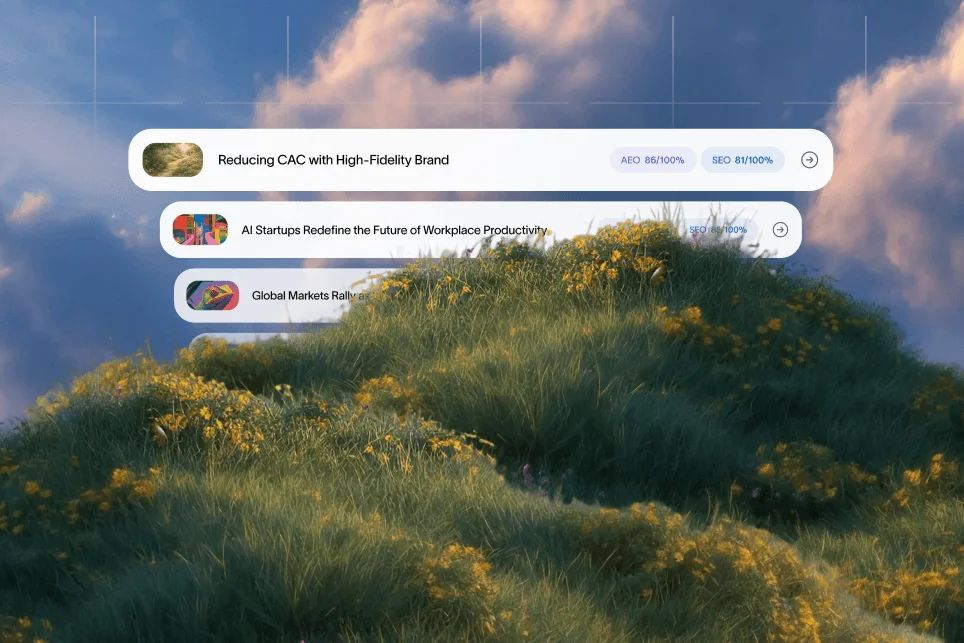
1. Feature-level prompt coverage
Ask AI systems the same kinds of category and use-case questions your buyers ask.
Examples:
- Which tools offer automated renewal alerts?
- What SaaS platforms include approval workflows for finance teams?
- Which CRM add-ons provide forecast dashboards and pipeline stage reporting?
Track whether your brand is mentioned, whether the feature is described accurately, and whether a citation appears.
As Sedestral’s overview of AI search visibility tools notes, brands now need visibility across environments like ChatGPT, Perplexity, and Google AI Overviews. That means your measurement setup should not stop at Google Search Console.
2. Citation source mapping
When your brand does appear, find out which page the model seems to rely on.
If AI systems keep pulling from a third-party review site instead of your product page, that tells you your own page is not carrying enough extractable authority. AIClicks specifically frames this around identifying the sources that drive citations, which is exactly the diagnostic mindset teams need.
3. Assisted conversion quality
Watch what happens after the click.
If AI-assisted visitors land on your page and bounce, the issue may not be discoverability anymore. It may be message match. The feature the AI answer surfaced has to be obvious within the first screen or two of the landing page.
4. Refresh velocity
Product screenshots age fast. So does feature copy.
Any page that depends on UI proof should be reviewed on a fixed schedule. If the interface changed and the surrounding text did not, you create mistrust. If the text changed but the screenshot stayed outdated, you lose proof.
This is also where fragmented teams struggle. Content updates, SEO priorities, and product marketing changes drift apart. A platform approach helps because reporting and action live closer together. That is a core reason SaaS teams move away from disconnected workflows, which we break down in this ROI comparison.
The FAQ buyers and teams actually ask about screenshot visibility
Can AI systems read text inside screenshots?
Sometimes, but you should not rely on it. The safer approach is to repeat the important meaning in nearby text, headings, captions, and bullets so your page remains easy to extract and cite.
Should I invest in custom product visuals if AI mostly wants text?
Yes, but use visuals as proof, not as the whole explanation. Strong screenshots improve trust and conversion after the click, while structured text improves AI search visibility before the click.
Is alt text enough to make screenshots visible in AI answers?
No. Alt text helps, but it is only one signal. The strongest setup combines alt text, clear feature naming, scannable copy, and pages built around explicit use cases.
Do dedicated feature pages work better than one big product page?
Usually, yes. Dedicated feature pages make it easier to match search intent, explain a capability in depth, and give AI systems a clean source for citations.
How often should I refresh screenshot-heavy pages?
Review them whenever the UI or product positioning changes, and do a broader visibility check every 30 to 90 days. If a page supports an important revenue use case, refresh it more often.
What to do next if your screenshots look great but stay invisible
If your screenshots are not contributing to AI search visibility, do not start by redesigning the page again.
Start by asking a more useful question: what exact product claim should this image help prove, and is that claim obvious without the image?
That shift changes everything. It moves you from visual decoration to citable evidence. It improves how AI systems retrieve your product details. It also makes the page clearer for buyers who skim, compare, and click with very little patience.
If you want to go further, measure your AI visibility, review which pages are actually being cited, and rebuild feature sections so every screenshot has a job. That is how you turn product visuals from nice-looking assets into part of your ranking and authority system.
If your team wants a cleaner way to do that work, Skayle helps SaaS companies rank higher in search and appear more consistently in AI-generated answers by connecting content production, optimization, and visibility tracking in one place.
References
- Neil Patel / Ubersuggest: AI Brand Visibility Tool
- SE Ranking: AI Visibility Tracker that fits your delivery map
- SUSO Digital: AI Search Visibility Tool
- Semrush: Free AI Brand Visibility Tool
- Sedestral: Best AI search visibility tools
- AIClicks: AI Search Visibility Tracking & Optimization Tool
- Mint: AI Search Visibility: What It Is and How to Optimize for It
- How to Measure Visibility in AI Search (LLMO Metrics …